Wednesday 25 April 2012

Final Post

This my my final post. Looking back at what I have created, I am really pleased with my outcome. Throughout this course, my skills in all aspects of media have greatly improved and I have learnt how to use many programs a lot better such as Photoshop.

These were my preliminary tasks and there is signs of vasts improvements in which how I have layed out everything. Also, clear signs of photo manipulation has been used.


These are my final designs of my front cover magazine. It has also vastly improved from 'Five-O' to 'New Sound' and also a change of models, background and text. To me, this seems as another great improvement as I had learnt many more easier ways to change the effects than than I knew during my prelim.

Final Evaluation

Tuesday 24 April 2012

This my double page spread. I had only designed one double page spread because I knew what I wanted to do for my double page spread as I had planned out everything whilst taking my pictures already. I purposely told my model to to look up because I wanted him to look at the quote. I had already thought of things like quickfire questions and how I would lay them out.

If you examine closely, behind the text, the picture is blurred so that you can read the text clearer. Before, this had not been done and the text was hard to read.

I also included a little introduction before the questions were asked to warm up the audience a little and to inform them what this is about.

I used a clear, big, bold title for readers to know what it is about and the colour scheme relates back to my model.

Next to my model, I have included details about the picture and who had taken it for a professional look.

Page numebrs have also been added
This my final design for my contents page. I had chosen this design because it links in very well with my front cover and double page spread. I had chosen the colour beige because my front cover background has been photoshopped into a dark beige looking colour and I thought there should be a link between the two. The fonts that I have used are also the same including font size and how the layout is based. Looking at my front cover and comparing it with this, you can tell that they are part of the same magazine as they both have the same fonts and similar stories. Also, the stories are seperated by a line which clearly states that a new story is starting.

I had used polaroids at the top of the page to give off a more personal feel towards to magazine and also a indie twist to this magazine as it is not all just hip hop. In the magazine I have also included many puns such as 'Ghost 26 New Album: SMOKING HOT' and it shows a picture of him breathing out smoke. 'Shyne Saves His STARDOM' because his name is Shyne and it represents 'Shine' and 'Stardom' is some sort of bright light relation.

The four colours that I have used green, burgundy, white and black. I had chosen these colours because my model was wearing these colours at the time and I wanted a relation to it, so I kept it flowing throughout my front cover and contents page.

On the bottom right a Facebook and Twitter logo is featured which informs readers that they can like them on Facebook or Follow them on twitter for news updates, competitions and such.

'Know your Swagger, up your game' I had added this near the end because the spot felt empty and it needed something. I had taken this from my front cover and linked it in because from getting feedback, I have been informed that my audience likes the word swagger and the way I had used an italic 'S' to start it off shows off some sort of class and superiority.

Saturday 14 April 2012

final front cover

This my my final product for my Media AS Music Magazine project.
After many adjustments and tweaks I am happy with my outcome. My front cover is designed to give off a hip hop look style but also have a hint of indie to tell the audience that it is not your average magazine. I have also used appropriate colour scheme which matches my model but goes against the black, white, red colour scheme, I did this to show that my magazine is different to others.

The barcode is placed on the bottom right hand side and I have added an issue number, the month and the price. I did this because I wanted my barcode to look as professional as possible. Above that, I have a giveaway pair of Nike Dunks and I think this is an effective way of people to buy this magazine because people will always be attracted to freebies.

My text is wrapped around my artist so that it shows that he is the centre of attention and I want everyone to know that he is the main focus.

My font for my front cover has a reason behind it. Because the font has a background city to it it represents that this magazine has a history of hip hop and the different colour text would represent that it has another genre twist to it. I have also added a website above it to show professionalism.

I also put in another freebie which can allow the reader to win tickets to go see Kanye West and Kay-Z live.

Tuesday 10 April 2012

Curves

The ability to change the colour of my image with curves in Photoshop have been a massive benefit as it is where I manipulate my images and give it the instagram look. I did this on photoshop because I wanted to learn how to manipulate them without using a pre-installed filter.

Saturday 10 March 2012

Photoshop

Photoshop was the main key to my completion of my music magazine. The majority of things that I had created had been done on Photoshop CS 3 and CS 5. Before I had started this, I already knew some basic knowledge about Photoshop and how to use it as I previously studied art and had learnt about it.

I have picked up new things such as how to blur out certain parts of an image. For example in my double page spread, behind the writing, the picture is blurred.

I have learnt how to manipulate an image and remove certain errors in the pictures for example:


With this, I had copied another part of his trouser and pasted it on top of the mark so that it would be covered and looking fresh.

I also learnt how to manipulate the curves, levels and colour balance of images like this:


A reason in which I wanted to edit my picture and not just keep the original is because I had done some market research and had realised that many young adults/ teenagers like manipulating their pictures into a grainy, vintage look. An iPhone app that I have been using and looking at is called 'Instagram' which allows you to take a picture then put a filter on it for a vintage look.


Then learning to cut out an original image and pasting it out onto another one like this:

After editing this on photoshop, I had decided that the model had been manipulated too much. So I had decided to cut out my model from the original picture with the aid of photoshop and the selection tool. Once I had done this, I just made an extra layer on top of the edited picture and placed it in line with it.

Friday 9 March 2012

These two magazines are my improvements from the previous post. As you can see, I had taken a change in the name as my further research shows that often when hip hop artist talk about the police, it is usually not a very good thing and for that reason, naming my magazine, Five-O would totally go against it. This weakness has been resolved and I have now changed my magazine name to what my target audience decided would be best for it, 'New Sound'.

These two front covers are not yet the final cover as I still have much more detail and text to add onto it. However, a lot of decisions upon where the text will be placed and the image layout has already been made.

As you can see, my main artist is called 'Carlos Miller' and I have effectively put his name next to the artist's face at the bottom and then struck 2 lines slanted downwards behind it. This is to give it a modern yet indie look and it would also represent a police line with the cover on the bottom.

An exclusive text has been added to emphasise that the text underneath would show significance of it being exclusive and would attract the audience.

the colour scheme of this magazine blends well with my artist which was beige and I had chosen an opposite colour for a contrasted look.

However, I feel that my magazine does not feel Hip Hop/ Indie enough which I had then decided I will not be using this layout as my final design.
This is my rough sketch up for my front cover magazine. When I did this 2 weeks ago, it only had the magazine name a block and my artist for my front cover. Much improvement has been added onto my front cover as you will see in the next post.

When I had created this, I wanted to go for a mysterious look, but I also wanted it to show anger and minimal emotion. I had created this effect with the use of a hood. This give my target audience a sense of mystery and a edgy scary look.

Monday 5 March 2012

This is my unfinished front cover for my music magazine. Originally the magazine was going to be called 'Five-O' but I had changed it because it does not really seem to relate to the genres as studies show that usually when the police are mentioned, it is not a good thing. I went with New Sound because Hip Hop/ Indie is two new types of genres that have been put together.

The colour scheme that is used has been taken from the artist which presents a green/blue colour and the opposite of this colour would be a dark shade of orange. This therefore makes the colours work well and also ensure my artist to stand out.

Additional details such as the barcode, pull quotes and information would be added on at a later stage.

Thursday 1 March 2012

Potential Double Page Spread

This is my potential double page spread picture. The idea of this picture had been taken from a double page spread which features Fearne Cotton, in which the picture takes up both the two pages and the writing is placed directly onto the image. Her picture had went well with the text that was on it and hopefully mine will also relate as it contains graffiti and my magazine is based on hip hop/indie in which their culture does contain a lot of graffiti and street art.

Potential Front Cover

My final model for my magazine cover. I had done some research and I was highly advised not to use a background with a brick wall but I wanted to be original just like my magazine is. My model is giving off a dull angry expression just like any other hip hop magazine, however, the way he is dressed and presented contains some hints of indie culture which would tell the audience that it is no ordinary hip hop magazine, but instead,with a hint of indie.

Monday 27 February 2012

This is my potential model for my front cover and I have done a close up shot of his face. It only has half a face for a mystery and because the other half may be featured on another page.
I did this because it gives it a sense of anger and cool which is perfect for my magazine.

Wednesday 15 February 2012

Reader Profile

Karter is a 17 year old currently in College located in the South of London. He is a very enthusiastic and outgoing person. He studies, Media, ICT, Art and Music and in the near future, he wants to go to Uni and study Media as it is his aim to achieve well in the Media industry. His love for music has always been strong but as he aged he had discovered what type of genre he really liked which is Rap with aspects of Indie and Alternative.
Many young people like Karter are like this, they enjoy genres of music that the society do not think would mix well therefore they do not exist. However, my magazine, you could say is built for Karter and many like him as it has both genres that they enjoy and love to listen to.

Tuesday 14 February 2012

Scamps [Re-Upload]

This is my scamp for my front cover, I had designed this before I had taken my pictures of my models so I had a rough idea of what to take. The text and everything else is just there so I have a rough idea of what to do. Nothing is for certain.

My contents page was fairly straightforward, I wanted polaroids at the top for a indie and personal twist and just a typical looking contents page at the bottom, but also standing out at the same time. I will have something standing out of the page which does not match anything in my magazine because I want it to be unique. A brand name or an artist would be ideal.
My double page spread is quickfire questions with an introduction to let the reader know what the magazine will be talking about. A clear heading would be added and a picture of him would be used as the background.

Whilst uploading my scamps I had come across a technical error in which I had to remove them and upload them again.

Monday 13 February 2012

Updated Survey.

I had decided that 5 questions would be too minimal for my survey so I added another 3 more.
This time I had included some text before the survey so my participants can have a better understanding on why they are filling out this survey. If you would like to fill out this survey, click here
Here are the new and updated questions:


Sunday 12 February 2012

Questionnaire

I have created a questionnaire on SurveyMonkey. This is a site where it allows me to create a questionnaire online and allow users to fill it out in which I can collect data from it.

If you would like to participate in this questionnaire please click here.

Below is a screenshot of what my questionnaire is like. I have narrowed it down to 5 questions because from filling out some questionnaires myself and past experiences, I have learnt that people have a low attention span and get bored f questionnaires if they drag on too long. I believe that my questions asked are useful and can contribute well to my research of my magazine.


The reasons why I asked these questions is because I would like to know what I can include in my magazine, such as freebies and extra issues released on special occasions. It is also vital that I chose a name that my target audience likes.

Friday 10 February 2012

Magazine Cover.

Here is another front cover of an XXL magazine. This cover is quite a unique one as it is a double page spread front cover. How it works is that it is folded and the reader is able to unfold it fully to reveal the full concept of the front cover which shows 13 artists as a 'posse' all looking fairly angry.

The anger, yet again is another interesting trate of XXL. I have done some research and noticed that the majority of their front covers have an artist posing with anger.

If I were to make my front cover like this, it would be of high difficulties as I would have to find models to pose as a posse and make it seem 'real' also, it may be hard to explain to the examiner how my front cover is laid out.

However, this idea can be done and if so, I would like to furthermore research more into front covers like this.

Five-O or New Sound

This is a potential name for my magazine. I had decided to call my magzine Five-O because quite often, artists in a hip hop, rap genre always have lyrics that relate back to the police, also known as 'Five-O'.
Another reason for this would be, my magazine, each month would include a full review of the five biggest artists of the month. They would all have one page and for the final artist, it would be a double page spread.

A final reason for naming my magazine this would be that this magazine would be released on the 5th of every month. This would furthermore give the readers a better understanding of the magazine itself.

This is my other potential magazine name. I am in the process of choosing which one I would like to use as they both have really good representations.

With New Sound, it gives off a meaning that there is actually as new sound as my magazien focuses on indie and hip hop genres which is quite new.
The font also has a city landscape which could represent the music and the different colour could mean the different genres.

Target Audience.

My selected target audience would be aimed at 15-23 year olds. I am this specific because I know that these types of genres that I am writing about (R&B/INDIE) would not suit the majority of older people as it is a weird mix of genres and during the stages when we discover music, it was not an option. R&B/Indie collaborations have been a recent thing, with artists such as Drake and The Weeknd.

I would like to aim my price of the magazine for about £3.50 as it would be released monthly.

Survey Monkey

I have created an account on survey monkey to do my research online. It can be posted on social networking sites and I can also make print outs and hand it out to my selected target audience.

Monday 6 February 2012

DPS.

In lesson we were taught a better understanding of what to look out for and what to do in a double page spread. We had been told what to look out for, such as presentational devices such as a headmast, pull quotes, images, fonts, colour schemes and font sizes.

We had looked at a Grazia magazine with Fearne Cotton as the main subject for their double page spread. Grazia went for a sepia, vintage looking look for it as the image took up the whole two pages and had been manipulated on photoshop for a vintage look effect. Her name, 'Fearne' had the biggest font size so we would see her name straight away, we then would focus on a quote underneath whcih was the second biggest font on the page.

What I had understood from Grazie's double page spread is that, the image and the text must work well together in order to give it a completed, finish look.

I believe that for my magazine, I will be able to acomplish the standards of a real magazine.

Friday 3 February 2012


I created a Wordle for my blog and magazine which contained words that are highly and greatly related to what I am currently working on, as you can see many words contain artists and their songs, along with some genres, lyrics and key words towards their success.

Wednesday 1 February 2012


XXL Magazine. I am going to deconstruct XXL Magazine for my set work with use of semiotics and polysemics. I chose this because it can relate to my magazine that I will be creating because it is along the lines of Hip Hop, Rap, Indie and R&B. The main cover of this magzine is of 'Jay-Z' and what we can see straight away is Jay-Z and a photoshopped reflection of a city in his glasses. Without looking at the text, we can tell that Jay-Z is serious because of the angle of gaze and his facial expression. It could represent that he may be here for something and is a serious matter.

The way the magazine is set out, with a dark background and a close up shot of Jay-Z could represent that the magazine has a dark background and another darker meaning inside, what will it be? We are not sure yet.

Now, with the text added, we are sure that the main attraction of the magzine is Jay-Z, his name is written in capitals and bold, and the outline of his name is in white. Underneath his name is written in italics 'Return of the Hustle' also written in a gold colour, which would emphasise his 'Hustle' and notice how 'Hustle' is written with a capital letter to emphasise the power. The quote also would imply that Jay-Z is back for a hustle with his music which mixes well with the image in his sunglasses as it could imply that he is out to hustle the whole city.

Thursday 26 January 2012


Dev. We all know Dev from the song 'Like A G6' by Far Eat Movement. And recently she was featured in one of JLS' songs, 'She Makes Me Wanna'. However, Dev also makes her own music and is also in the genres of indie, pop and hip hop. She can sing amazingly well and can also rap rather good.

She had released her own album 'The Night The Sun Came Up' and it was a huge success. One of her songs 'In The Dark' peaked at number 10 in the US Charts.

Dev was also tipped to be the next 'Ke$ha' in clubs because of her unique voice and club like music.

Drake Feat.Lykke Li - Little Bit


Here is another song that Drake is featured in with an indie/pop artist, 'Lykke Li'. The song is called 'Little Bit' and is about love.

Suprisingly, R&B works brilliantly with Indie. When you listen to this song, it sounds exciting yet chilled out. This is what type of effect I would want my magazine to give off to my readers.

The sogn was released in 2008 and is not that known but many people that have heard this song knows what potential both artists hold.

The Weeknd - The Zone (Ft. Drake)


This is by an artist called 'The Weeknd'. He is an indie, r&b, hip hop artist which seems very original as they are unusual genres to mix with.

The Weeknd is a good friend of world wide successful artist, 'Drake' and he is also featured in this song 'The Zone'. I posted this song on my blog because my magazine will be directed at a Indie/R&B audience. I chose this because I like both the genres and it is rare to see a magazine that focuses on these two genres, specifically.

The Weeknd reached fame when Drake tweeted part of his lyrics to all his fans and The Weeknd had kept his identity anonymous to attract much more attention.

What I would like to do is find upcoming artists like The Weeknd and do a few photoshoots and interview with them so that they could be featured in the magazine.

How to upload videos onto my blog.

We were told as a class to research on magazine covers and music that we want to include in our magazine.
Our teacher taught us how to embed html links into a post in which uploads the video to our blog, but I had found a much easier way.


The way I had discovered was to share it. YouTube gave me the option of sharing this video to various blogging sites with ease. All I had to do was to click on the blogger icon and then it automatically opens up a new post in a new tab and I can post it on there by publishing the post.

I had then informed my teacher of this easier way she could tell everyone else in my class which benefitted us all greatly.
'XXL' magazine is another magazine I will be researching on. The front cover is of a successful artist
Kanye West.

The magazine cover has a unique design in which at the middle of the page, it is repeated but upside down. Reasons for this may be because in the middle, it says 'Love' and upside down 'Hate'. Also, there is a caption near him saying 'The exclusive story by the man himself' which could represent the love hate relationship and by saying 'The man himself' would give the report a mysterious feeling which would attract the reader even more, would they be interviewing West or someone else?

The colour scheme of this magazine is red, black and white. It focuses more on the black and white which would also represent the 'Love' and 'Hate' as black and white are opposite tones. The red is only based on the magazine's headmast to emphasise the actual magazine itself, 'XXL'.

West's picture is made black and white to go with the colour scheme and to also give it a cool, smart and professional look as if this magazine has class. His facial expression is also rather straight with hints of aggression which is seen in a lot of other XXL magazine covers.

Underneath the headmast, it also says 'Special Collector's Issue' which could also be a relation to the edits made in the picture, because this magazine looks so crisp and unique it would be classed as a special collector's edition.

Overall, the magazine is extremely simple, I think the design was like this because it shows class, importance, focus and specialty. 

Tuesday 24 January 2012

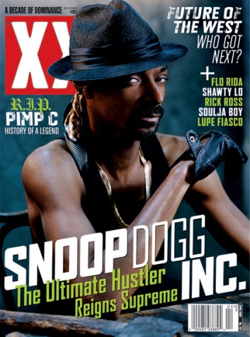
This is the 'NME' magazine.
I have chosen to analyse this magazine again because it would benefit me greatly as I want my magazine to look as good and as successful as this very one.

The main artist/model featured in this 'commemorative issue' for Prince William and Kate Middleton is 'Tyler, The Creator'. He is a world famous rapper, record producer, music video director, actor, graphic artist and fashion designer from Los Angeles, currently signed to English independent record label XL Recordings and his own record label, Odd Future Records.

The magazine has quite cleverly  made Tyler pose with crowns on his head and in a pose which would show signs of being posh, which would relate to the royal wedding. However, there is a pull quote said by telling exclaiming that, 'I don't give a sh*t about the royal wedding' which conflicts with the whole point that this extra magazine was created because it was originally for the royal wedding.

In some aspects, this magazine replicates the 'Rolling Stone' magazine, it has the effect of the cover photo covering the masthead, just like the Rolling Stone magazine, explained in my previous posts.

'Tyler, the Creator' is the main attraction to this magazine and his name is also the first thing we see. This could show signs of him 'not giving a sh*t' about the royal wedding as it overtakes the whole point of the magazine's original idea.

The colour scheme only consists of four colours, red, white, black and blue. The blue is being worn by Tyler and it should represent his originality and how often he stands out from anyone else. Red is a colour that can stand for danger, or royalty. In this case, it could be both as the royal wedding would have been taking place when the magazine was released and danger because Tyler is there and he is an unpredictable character.

On the edges of the magazine, it has a brown, gold like frame which could also represent royalty because it could insinuate that this magazine has framing material because of the royal wedding or because Tyler is becoming such a sensation to the music industry.

Monday 23 January 2012

Rolling Stone Magazine

As a group we researched and analysed the rolling stone magazine in order to find out codes and conventions of the magazine. (below is a printscreen of out research)

The rolling stone magazine is one of the most well known magazines that portray music. The magazine was found in San Francisco in 1967 by Jann Wenner. The covers often portray a successful artist or group posing and majority of the time, their face or body covers the actual title itself.


Friday 20 January 2012

Martians Vs. Goblins


A video by an artist called 'The Game' featuring 'Tyler, The Creator'.
The video is based on Martians and Goblins and the two artists are talking about either one.
Tyler, which released his album 'Goblin' last year ironically supports Goblins and The Game is for Martians.

The lyrics may be too explicit for younger person(s) viewing.

I chose to upload this video because my music magazine would be aimed at people who are into this genre, which is, hip hop, r&b, rap. Also, it may be seen as indie too as Tyler is well known and loved by many indie artists and indie followers.

Monday 16 January 2012

Photoshop.

Can you spot the difference? Here, I have photoshopped an object out of the picture because it took away too much attention from the main subject, which is, Sasha. I had taken out the pole to her left. I did this by copying certain parts of the image that had similar surroundings to what need to be covered.