Monday 27 February 2012

This is my potential model for my front cover and I have done a close up shot of his face. It only has half a face for a mystery and because the other half may be featured on another page.
I did this because it gives it a sense of anger and cool which is perfect for my magazine.

Wednesday 15 February 2012

Reader Profile

Karter is a 17 year old currently in College located in the South of London. He is a very enthusiastic and outgoing person. He studies, Media, ICT, Art and Music and in the near future, he wants to go to Uni and study Media as it is his aim to achieve well in the Media industry. His love for music has always been strong but as he aged he had discovered what type of genre he really liked which is Rap with aspects of Indie and Alternative.
Many young people like Karter are like this, they enjoy genres of music that the society do not think would mix well therefore they do not exist. However, my magazine, you could say is built for Karter and many like him as it has both genres that they enjoy and love to listen to.

Tuesday 14 February 2012

Scamps [Re-Upload]

This is my scamp for my front cover, I had designed this before I had taken my pictures of my models so I had a rough idea of what to take. The text and everything else is just there so I have a rough idea of what to do. Nothing is for certain.

My contents page was fairly straightforward, I wanted polaroids at the top for a indie and personal twist and just a typical looking contents page at the bottom, but also standing out at the same time. I will have something standing out of the page which does not match anything in my magazine because I want it to be unique. A brand name or an artist would be ideal.
My double page spread is quickfire questions with an introduction to let the reader know what the magazine will be talking about. A clear heading would be added and a picture of him would be used as the background.

Whilst uploading my scamps I had come across a technical error in which I had to remove them and upload them again.

Monday 13 February 2012

Updated Survey.

I had decided that 5 questions would be too minimal for my survey so I added another 3 more.
This time I had included some text before the survey so my participants can have a better understanding on why they are filling out this survey. If you would like to fill out this survey, click here
Here are the new and updated questions:


Sunday 12 February 2012

Questionnaire

I have created a questionnaire on SurveyMonkey. This is a site where it allows me to create a questionnaire online and allow users to fill it out in which I can collect data from it.

If you would like to participate in this questionnaire please click here.

Below is a screenshot of what my questionnaire is like. I have narrowed it down to 5 questions because from filling out some questionnaires myself and past experiences, I have learnt that people have a low attention span and get bored f questionnaires if they drag on too long. I believe that my questions asked are useful and can contribute well to my research of my magazine.


The reasons why I asked these questions is because I would like to know what I can include in my magazine, such as freebies and extra issues released on special occasions. It is also vital that I chose a name that my target audience likes.

Friday 10 February 2012

Magazine Cover.

Here is another front cover of an XXL magazine. This cover is quite a unique one as it is a double page spread front cover. How it works is that it is folded and the reader is able to unfold it fully to reveal the full concept of the front cover which shows 13 artists as a 'posse' all looking fairly angry.

The anger, yet again is another interesting trate of XXL. I have done some research and noticed that the majority of their front covers have an artist posing with anger.

If I were to make my front cover like this, it would be of high difficulties as I would have to find models to pose as a posse and make it seem 'real' also, it may be hard to explain to the examiner how my front cover is laid out.

However, this idea can be done and if so, I would like to furthermore research more into front covers like this.

Five-O or New Sound

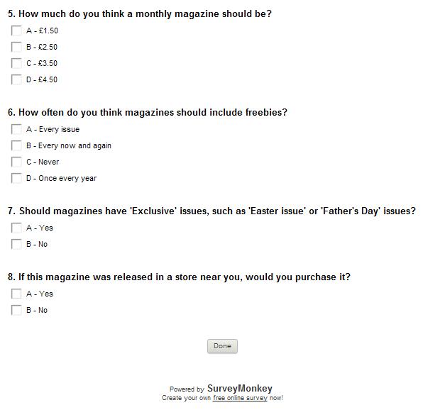
This is a potential name for my magazine. I had decided to call my magzine Five-O because quite often, artists in a hip hop, rap genre always have lyrics that relate back to the police, also known as 'Five-O'.
Another reason for this would be, my magazine, each month would include a full review of the five biggest artists of the month. They would all have one page and for the final artist, it would be a double page spread.

A final reason for naming my magazine this would be that this magazine would be released on the 5th of every month. This would furthermore give the readers a better understanding of the magazine itself.

This is my other potential magazine name. I am in the process of choosing which one I would like to use as they both have really good representations.

With New Sound, it gives off a meaning that there is actually as new sound as my magazien focuses on indie and hip hop genres which is quite new.
The font also has a city landscape which could represent the music and the different colour could mean the different genres.

Target Audience.

My selected target audience would be aimed at 15-23 year olds. I am this specific because I know that these types of genres that I am writing about (R&B/INDIE) would not suit the majority of older people as it is a weird mix of genres and during the stages when we discover music, it was not an option. R&B/Indie collaborations have been a recent thing, with artists such as Drake and The Weeknd.

I would like to aim my price of the magazine for about £3.50 as it would be released monthly.

Survey Monkey

I have created an account on survey monkey to do my research online. It can be posted on social networking sites and I can also make print outs and hand it out to my selected target audience.

Monday 6 February 2012

DPS.

In lesson we were taught a better understanding of what to look out for and what to do in a double page spread. We had been told what to look out for, such as presentational devices such as a headmast, pull quotes, images, fonts, colour schemes and font sizes.

We had looked at a Grazia magazine with Fearne Cotton as the main subject for their double page spread. Grazia went for a sepia, vintage looking look for it as the image took up the whole two pages and had been manipulated on photoshop for a vintage look effect. Her name, 'Fearne' had the biggest font size so we would see her name straight away, we then would focus on a quote underneath whcih was the second biggest font on the page.

What I had understood from Grazie's double page spread is that, the image and the text must work well together in order to give it a completed, finish look.

I believe that for my magazine, I will be able to acomplish the standards of a real magazine.

Friday 3 February 2012


I created a Wordle for my blog and magazine which contained words that are highly and greatly related to what I am currently working on, as you can see many words contain artists and their songs, along with some genres, lyrics and key words towards their success.

Wednesday 1 February 2012


XXL Magazine. I am going to deconstruct XXL Magazine for my set work with use of semiotics and polysemics. I chose this because it can relate to my magazine that I will be creating because it is along the lines of Hip Hop, Rap, Indie and R&B. The main cover of this magzine is of 'Jay-Z' and what we can see straight away is Jay-Z and a photoshopped reflection of a city in his glasses. Without looking at the text, we can tell that Jay-Z is serious because of the angle of gaze and his facial expression. It could represent that he may be here for something and is a serious matter.

The way the magazine is set out, with a dark background and a close up shot of Jay-Z could represent that the magazine has a dark background and another darker meaning inside, what will it be? We are not sure yet.

Now, with the text added, we are sure that the main attraction of the magzine is Jay-Z, his name is written in capitals and bold, and the outline of his name is in white. Underneath his name is written in italics 'Return of the Hustle' also written in a gold colour, which would emphasise his 'Hustle' and notice how 'Hustle' is written with a capital letter to emphasise the power. The quote also would imply that Jay-Z is back for a hustle with his music which mixes well with the image in his sunglasses as it could imply that he is out to hustle the whole city.